Small Multiples
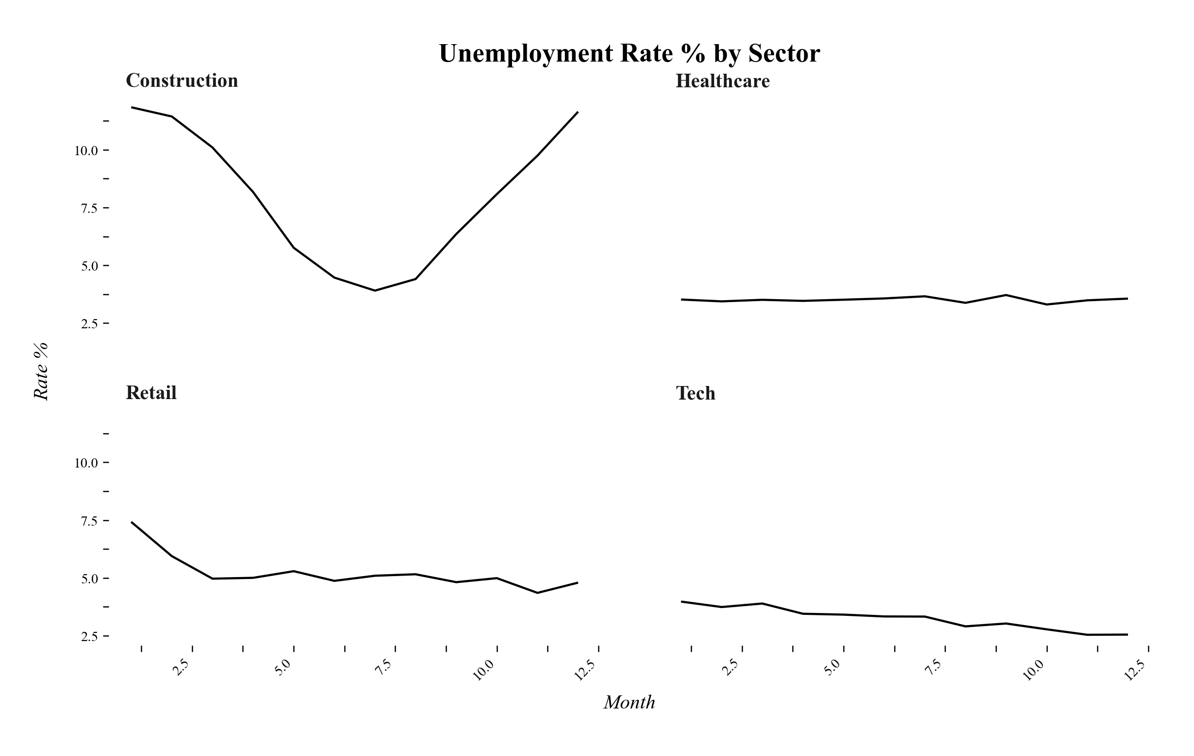
Small Multiples zeigen mehrere ähnliche Plots nebeneinander, um Vergleiche zwischen Gruppen oder Zeitpunkten zu ermöglichen, dabei teilen sich immer zwei Plots die X und Y-Achse.
Funktion
def small_multiples(
    df: pd.DataFrame,
    x_col: str,
    y_col: str,
    facet_col: str,
    title: str = "Small Multiples",
    ncol: int = 4,
    x_label: str | None = None,
    y_label: str | None = None,
    **kwargs
) -> ggplot:
Parameter:
- df (
pandas.DataFrame): Daten für die einzelnen Plots - x_col (
str): Spaltenname für die X-Achse (kategorisch oder kontinuierlich) - y_col (
str): Spaltenname für die Y-Achse (numerisch) - facet_col (
str): Spaltenname für die Facettenkategorie - title (
str, optional): Plot-Titel - ncol (
int, optional): Anzahl der Spalten für die Facettenanordnung (Standard: 4) - x_label (
str, optional): Beschriftung der X-Achse - y_label (
str, optional): Beschriftung der Y-Achse - kwargs (
optional): Zusätzliche Argumente für geom_line (z.B. color, alpha)
Rückgabewert:
- plot (
plotnine.ggplot): Das ggplot-Objekt
Anwendungsbeispiel
Der folgende Beispielcode erzeugt den abgebildeten Beispieloutput.
import pandas as pd
import numpy as np
import dufteplots as dp

# Beispieldaten wie im Hauptbeispiel (monatliche Arbeitslosenquote in Sektoren)
np.random.seed(42)
months = np.arange(1, 13)
dfs = []
# Construction: Hohe Saisonalität
dfs.append(pd.DataFrame({
    "Month": months,
    "Rate": 8 + 4 * np.cos((months - 1) / 12 * 2 * np.pi) + np.random.normal(0, 0.2, 12),
    "Sector": "Construction"
}))
# Retail: Peak im Januar
dfs.append(pd.DataFrame({
    "Month": months,
    "Rate": 5 + 2 * np.exp(-(months - 1)) + np.random.normal(0, 0.2, 12),
    "Sector": "Retail"
}))
# Tech: fallende Arbeitslosigkeit
dfs.append(pd.DataFrame({
    "Month": months,
    "Rate": np.linspace(4, 2.5, 12) + np.random.normal(0, 0.1, 12),
    "Sector": "Tech"
}))
# Healthcare: stabil
dfs.append(pd.DataFrame({
    "Month": months,
    "Rate": np.full(12, 3.5) + np.random.normal(0, 0.1, 12),
    "Sector": "Healthcare"
}))
df = pd.concat(dfs)

# Small Multiples erstellen
plot = dp.small_multiples(
    df,
    x_col="Month",
    y_col="Rate",
    facet_col="Sector",
    ncol=2,
    title="Unemployment Rate % by Sector (Seasonal Patterns)",
    x_label="Month",
    y_label="Rate %"
)

# Plot anzeigen
plot.show()